
The decor trends for 2025-2026 articulate cross-references, long-lasting materials, and a precise focus on sensory ambiance. The concrete challenge of a project is to compose a coherent interior from these three axes without falling into accumulation.
Sensory and acoustic comfort: the technical foundation of successful decor
A successful interior is judged first by the ear and touch, not just by the eye. The underlying trend is to treat the room as a holistic environment: light, perceived temperature, sound reverberation. We observe that most decor projects neglect acoustics, even though it conditions daily comfort.
Further reading : Tips and Inspirations to Succeed in Your Home DIY Carpentry Projects
Thick textiles (lined curtains, dense pile rugs), natural fiber wall coverings, and upholstered furniture absorb sound reflections. A well-sized rug reduces reverberation better than a wall panel, provided it covers a sufficient area relative to the room’s volume.
On the lighting side, a single ceiling light is a design mistake. Layering three sources (indirect lighting in a strip, adjustable reading lamp, decorative pendant) allows for modulation of the ambiance according to use. The color temperature makes all the difference: a warm white around 2,700 K for rest areas, a neutral white for the kitchen or work surface.
You may also like : How to replace a damaged paver on your garden patio?
Professionals interested in decor on La Bonne Maison will find complementary approaches on the intersection of comfort and aesthetics.
Mixing decor styles: a method to avoid visual chaos
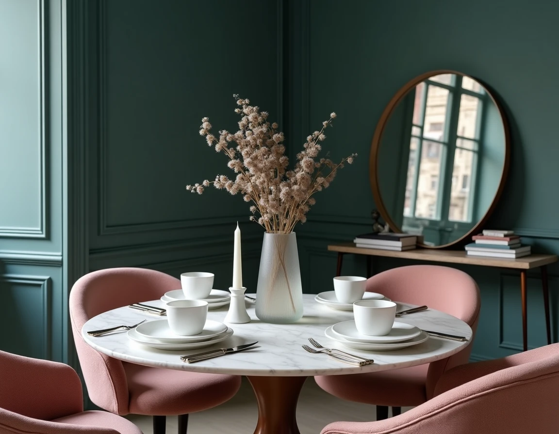
Mixing styles without a method produces an incoherent interior. Current trends value the combination of references (industrial and botanical, vintage and minimalist), but this freedom requires a rigorous framework.
We recommend setting two parameters before any purchase: the color palette and the dominant material family. A maximum of three base shades (walls, floor, large furniture), one or two accent colors for objects and textiles. Coherence comes from there, not from the style itself.
Combining materials without bad taste
Light wood pairs well with black metal or brushed brass. Polished concrete supports velvet but not woven rattan, whose light texture creates too harsh a contrast. The operational rule: do not exceed three material families per room.
- Raw or bleached wood, paired with linen or washed cotton, for a tempered natural register
- Metal (steel, brass, patinated copper) combined with leather or stone, for a more assertive register
- Handcrafted ceramics and plant fibers (jute, sisal) for an organic register that supports earthy colors well
The mix works when textures converse through controlled contrast, not through accumulation. A strong object per visual zone is enough. The rest serves as a background.
Upcycling and sustainable materials: decor trend or technical constraint
Upcycling is no longer a militant gesture; it is a lever for personalization that manufacturers are now integrating into their offerings. Reclaimed wood furniture, lighting fixtures made from refurbished industrial parts, textiles dyed with natural pigments: the sector is structuring itself.
What changes the game for a decor project is the longevity of natural materials compared to melamine panels or synthetic textiles. A solid oak tabletop can be sanded and refinished. A laminate countertop is replaced. Over time, the real cost reverses.
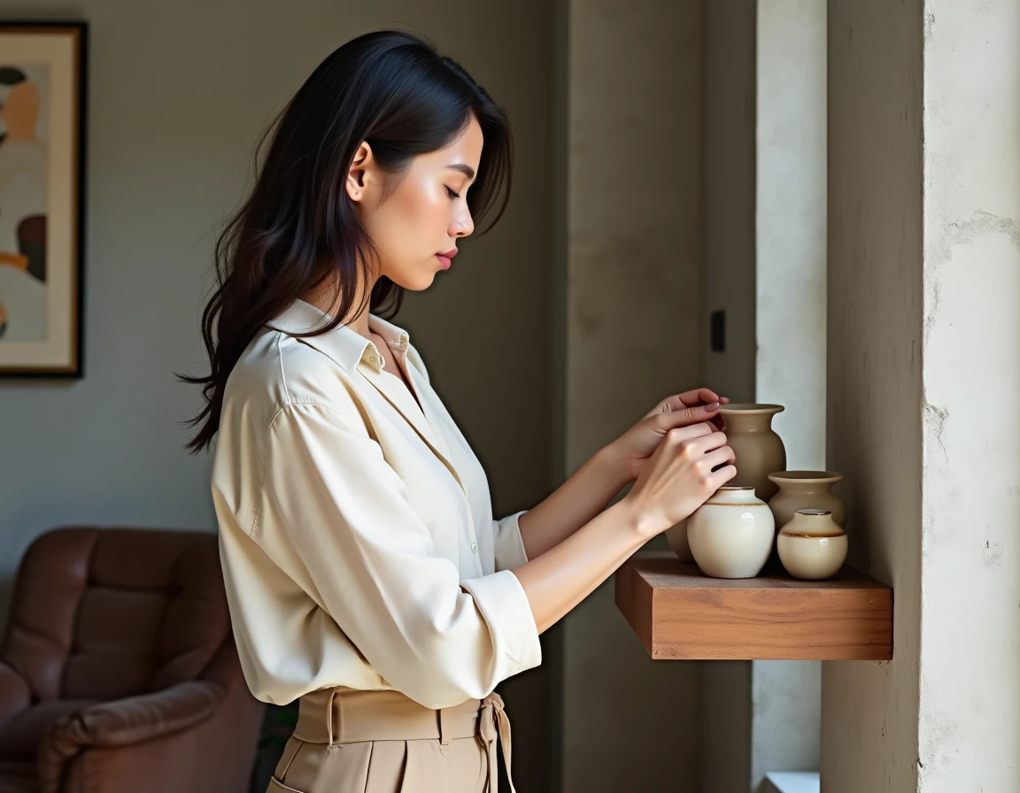
Unique pieces and thrifted objects: balancing between love at first sight and coherence
Integrating a thrifted piece into a contemporary interior requires treating it as a focal point, not as a decorative addition. We recommend limiting to one or two vintage pieces per living space, positioned where the eye naturally lands (facing the entrance, in a well-lit corner).
The rest of the furniture should remain understated so that the thrifted object can take its place. Too many strong pieces in the same visual field neutralize the desired effect.
Colors and wall decoration: technical choices that change a room
Color remains the fastest and least expensive lever for transformation. The 2025 palettes lean towards muted shades (softened terracotta, sage green, slate blue) rather than the off-whites that dominated the previous decade.
The finish of the wall matters as much as the hue. An absolute matte masks imperfections but marks easily. A slight satin reflects light and visually enlarges the space, at the cost of more demanding surface preparation.
- For a narrow room, painting the back wall in a darker shade creates optical depth
- In a living room open to the kitchen, using the same color in two finishes (matte on the living room side, satin on the kitchen side) unifies the space without monotony
- Lime-based plasters or mineral paints bring a surface vibrancy that standard acrylic paints do not replicate
Wall decoration: beyond the picture frame
The dressed wall (vertical slats, caned panels, textured wallpaper on a single wall) is gradually replacing the gallery of frames. This architectural treatment gives character to a space without adding objects to the floor.
One accent wall per room remains the rule to avoid saturating perception. The chosen wall should be visible as soon as one enters the room; otherwise, the investment goes unnoticed.
An interior that works over time relies more on technical decisions than on fleeting inspirations. Setting your color palette, limiting your material families, addressing acoustic and lighting comfort before choosing any decorative object: this sequence conditions the final coherence of the project.